Background
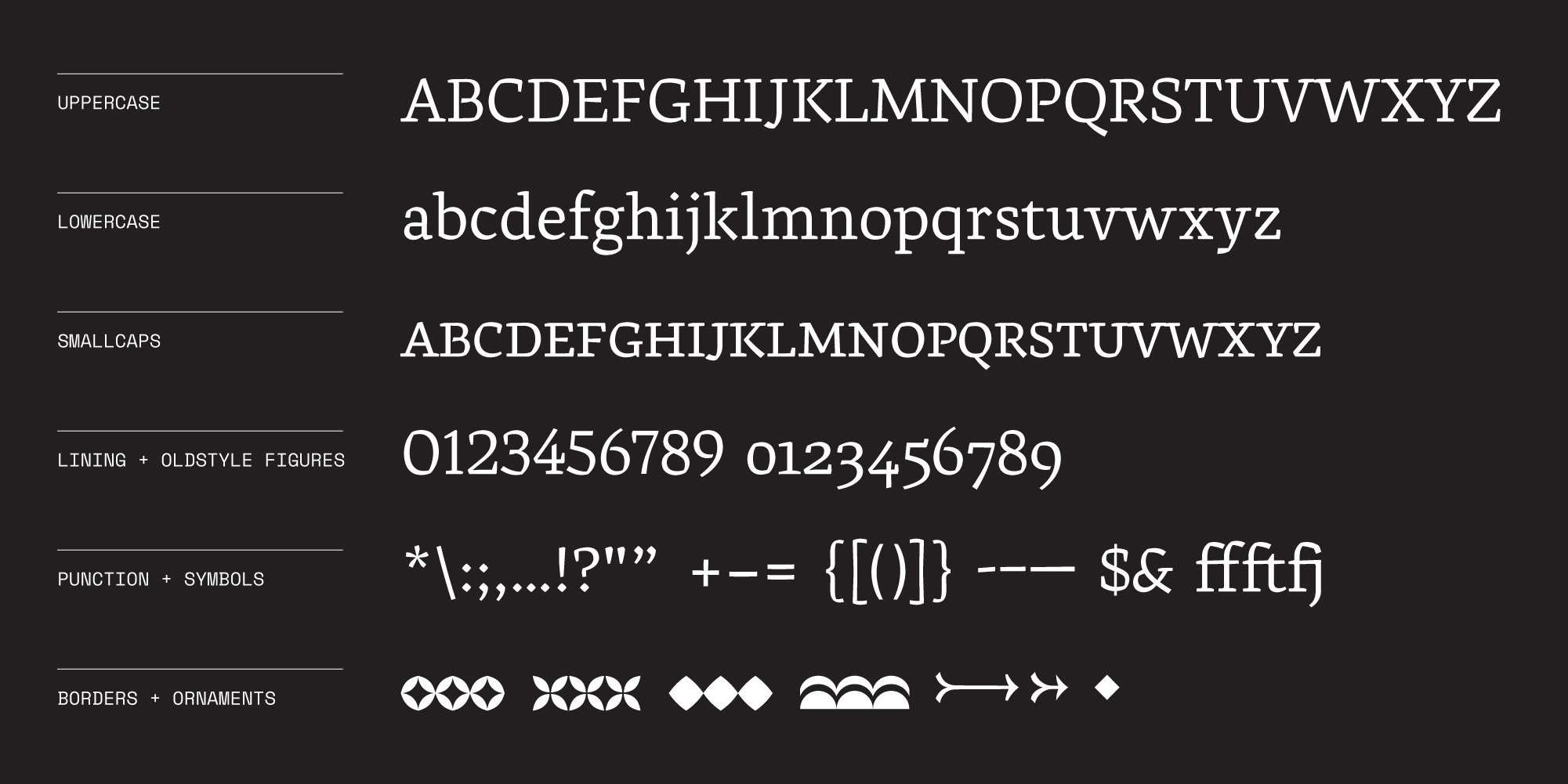
A transitional text typeface designed for smaller sizes. Marci Text combines conventions in the Italian humanist minsicule with broadnib blackletter. Inspired by broadnib pen and severe arches of the Italian Humanist Miniscule, Marci recalls tradition with a more transitional eye and severed expression.
References taken from Nick Sherman's Flickr Library

Features
Marci exudes expression and puncturing direction. Cascading sliced terminals in the R, Q, f, and c provide expression of the typeface while cascading arches in the a, s, and n mirror the same flow at the x-height. Additionally, Marci aims to retain a welcoming atmosphere while serving a strict point of view. The wideness of the letterforms and squareness in counterforms provides legibility at small sizes and offers a more friendly personality.
Concept
Marci is as clear as water and imitates the cascading sea. The flows of the x-height and terminals roll and topple over like the ocean and the wide letterforms are breathable enough to not become too formal.
Marci comes with borders and ornaments to allow typesetting in the same Mediterranean atmosphere.
The Specimen
The goal of the specimen booklet is to accentuate the personality of Marci. By using all of the features within the typeface including borders and diamond punctuation, the specimen solidifies "Transitional Mediterrean Micro-type" as Marci's specified genre.