Background
Fred Fuller Public Reserve is the metropolitan nature reserve in Kent Ohio. The park system encompasses 4 unique sectors where each sector can be visually defined by they're respective features: sporting, gathering, river pathway, and an urban hub. Utilizing a clear wayfinding system encourages guests to stay in the space as well as provide clear separation between the areas.
References taken from City of Kent, Ohio and the Kent, Ohio historical society
Goal
Differentiate 4 parks within the same identity while defining their unique benefits. The brand and system work together but keep each park unique by drawing upon symbols in the park environment.
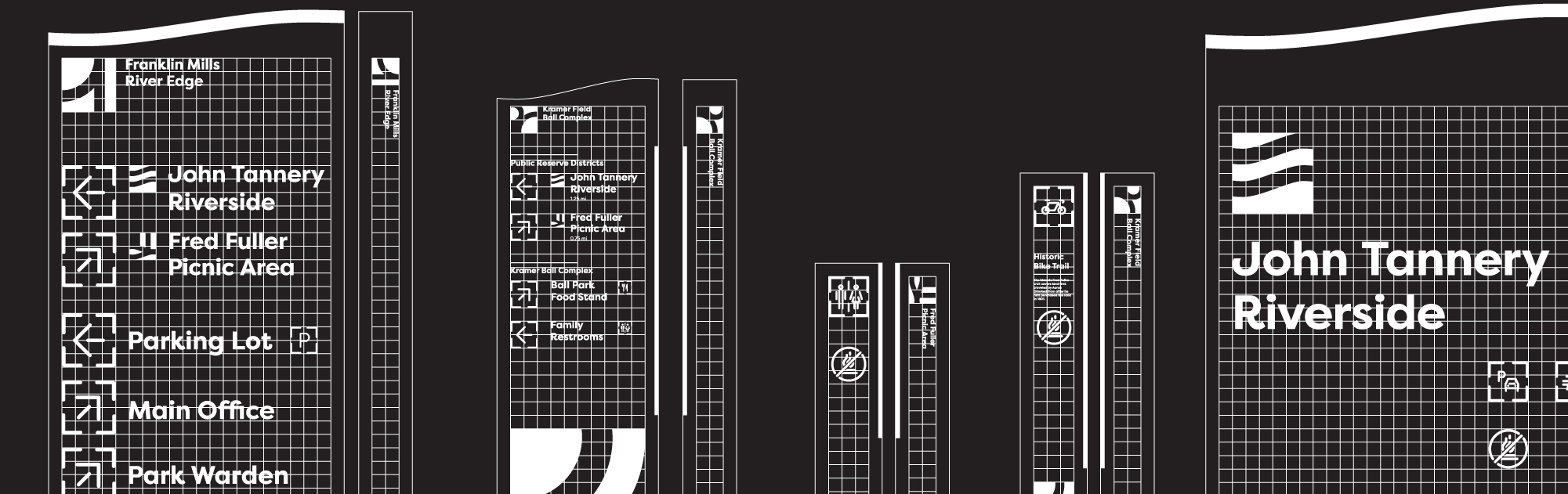
The Common Grid
A common grid opened the possibility of type dominant signage that inherently remained consistent with the logo. All elements within the brand exist on this common grid. Type dominant (rather than form dominant) sign structures allow more clarity for the guests without detracting from natural beauty in the environment. Minimal structural design is then easily accentuated by a complex type system. The brand of the signage is clear through use of the typeface and the elegant curvature at the top of each form.
Concept
Structural suburban elements unite with nature in Kent, Ohio. It felt necessary to keep the logomark iconic so as to claim the area of the park. The logo is a proud representation of a metropolitan nature reserve. In its gridded construction, the logo series work together and remain distinct from one another.
Accessibility
We are lucky to live in an age of increasing accessibility. It was important to create clear, legible, and consistent iconography that accentuated modularity of the signage and paired well with the minimalism in typography.